7QC Tools: The Ultimate Guide to Quality Control Tools:
Written By: Er. PARAMESWAR MURMU
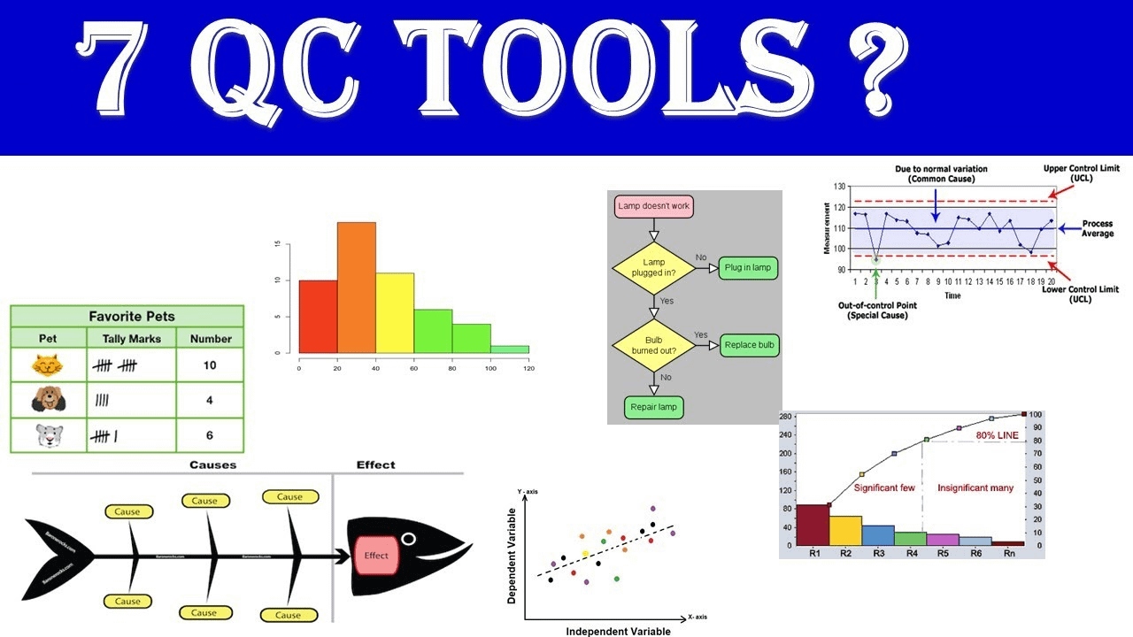
The Seven Quality Control (7QC) tools, also known as the Seven Basic Tools of Quality, are a set of fundamental techniques used in quality management and process improvement. Developed by Kaoru Ishikawa, a renowned Japanese quality control expert, these tools provide a systematic approach to identifying and solving various issues in manufacturing and business processes. The 7QC tools are widely utilized in industries worldwide to enhance product and service quality. Let’s delve into each tool:
Table of Contents
Introduction to the Seven QC Tools:
- Check Sheet.
- Histogram.
- Pareto Analysis.
- Fishbone Diagram.
- Scatter Diagram.
- Flowcharts.
- Control Charts.
Benefits of Implementing 7QC Tools:
How to Implement the 7QC Tools:
Real-World Examples of 7QC Tools Implementation:
Common Mistakes to Avoid:
Conclusion:
FAQs:
Introduction to the Seven QC Tools:
There are seven basic quality tools, which can assist an organization in problem-solving and process improvements. The first guru who proposed seven basic tools was Dr. Kaoru Ishikawa in 1968, by publishing a book entitled “Gemba no QC Shuho” which was concerned with managing quality through techniques and practices for Japanese firms. It was intended to be applied for “self-study, training of employees by foremen or in QC reading groups in Japan. It is in this book that the seven basic quality control tools were first proposed. valuable resource when applying the seven basic tools (Omachonu and Ross, 2004). These seven basic quality control tools, which were introduced by Dr. Ishikawa, are: 1) Check sheets; 2) Graphs (Trend Analysis); 3) Histograms; 4) Pareto charts; 5) Cause-and-effect diagrams; 6) Scatter diagrams; 7) Control charts. Figure 1 indicates the relationships among these seven tools and their utilizations for the identification and analysis of improvement of quality (Kerzner, 2009).
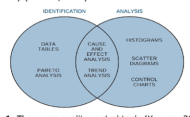
Figure 1: The seven quality control tools (Kerzner, 2009).
1. Check Sheet
Check sheets are simple forms with certain formats that can aid the user in recording data in a firm systematically. Data are “collected and tabulated” on the check sheet to record the frequency of specific events during a data collection period. They prepare a “consistent, effective, and economical approach” that can be applied in the auditing of quality assurance for reviewing and following the steps in a particular process. Also, they help the user to arrange the data for utilization later (Montgomery, 2009; Omachonu and Ross, 2004). The main advantages of check sheets are to are very easy to apply and understand, and they can give a clear picture of the situation and condition of the organization. They are efficient and powerful tools to identify frequent problems, but they don’t have the effective ability to analyze the quality problems in the workplace. The check sheets are in several, three major types are such as Defect-location check sheets; tally check sheets, and; defect-cause check sheets (Kerzner, 2009). Figure 2 depicts a tally check sheet that can be used for collecting data during the production process.
Figure 2: Check sheet (Tally) for telephone interruptions
2. Histogram
A histogram is a very useful tool to describe a sense of the frequency distribution of observed values of a variable. It is a type of bar chart that visualizes both attribute and variable data of a product or process and also assists users in showing the distribution of data and the amount of variation within a process. It displays the different measures of central tendency (mean, mode, and average). It should be designed properly so those working in the operation process can easily utilize and understand them. Also, a histogram can be applied to investigate and identify the underlying distribution of the variable being explored (Omachonu and Ross, 2004; Forbes and Ahmed, 2011). Figure 3 illustrates a histogram of the frequency of defects in a manufacturing process.
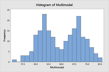
Figure 3: Histogram of variables
3. Pareto Analysis
It was introduced by an Italian economist, named Vilfredo Pareto, who worked with income and other unequal distributions in the 19th century, he noticed that 80% of the wealth was owned by only 20% of the population. later, the Pareto principle was developed by Juran in 1950. A Pareto chart is a special type of histogram that can easily be applied to find and prioritize quality problems, conditions, or their causes in the organization (Juran and Godfrey, 1998). On the other hand, it is a type of bar chart that shows the relative importance of variables, prioritized in descending order from left to right side of the chart. Pareto chart aims to figure out the different kinds of “nonconformity” from data figures, maintenance data, repair data, parts scrap rates, or other sources. Also, the Pareto chart can generate a means for investigating concerning quality improvement and improving efficiency, “material waste, energy conservation, safety issues, cost reductions”, etc., as Figure 4 demonstrates concerning the Pareto chart, it can able to improve the production before and after changes (Montgomery, 2009; Kerzner, 2009; Omachonu and Ross, 2004).
Figure 4: Pareto Charts
4. Fishbone Diagram
Kaoru Ishikawa is considered by many researchers to be the founder and first promoter of the ‘Fishbone’ diagram (or Cause-and-Effect Diagram) for root cause analysis and the concept of Quality Control (QC) circles. The cause-and-effect diagram was developed by Dr. Kaoru Ishikawa in 1943. It has also two other names that are Ishikawa diagram and fishbone because the shape of the diagram looks like the skeleton of a fish to identify quality problems based on their degree of importance (Neyestani, 2017). The cause and effect diagram is a problem-solving tool that investigates and analyses systematically all the potential or real causes that result in a single effect. On the other hand, it is an efficient tool that equips the organization’s management to explore the possible causes of a problem (Juran and Godfrey, 1998). This diagram can provide problem-solving efforts by “gathering and organizing the possible causes, reaching a common understanding of the problem, exposing gaps in existing knowledge, ranking the most probable causes, and studying each cause” (Omachonu and Ross, 2004). The generic categories of the cause and effect diagram are usually six elements (causes) such as environment, materials, machine, measurement, man, and method, as indicated in Figure 5. Furthermore, “potential causes” can be indicated by arrows entering the main cause arrow (Neyestani, 2017).
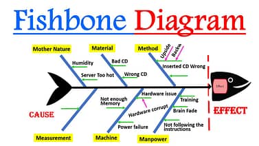
Figure 5: The cause and effect diagram (Fishbone Diagram)
5. Scatter Diagram
The scatter diagram is a powerful tool to draw the distribution of information in two dimensions, which helps to detect and analyze pattern relationships between two quality and compliance variables (as an independent variable and a dependent variable) and understand if there is a relationship between them, so what kind of the relationship is (Weak or strong and positive or negative). The shape of the scatter diagram often shows the degree and direction of the relationship between two variables, and the correlation may reveal the causes of a problem. Scatter diagrams are very useful in regression modeling (Montgomery, 2009; Oakland, 2003). The scatter diagram can indicate that there is one of the following correlations between two variables: a) Positive correlation; b) Negative correlation, and c) No correlation, as demonstrated in Figure 6.
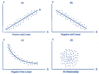
Figure 6: Scatter Diagrams
6. Flowchart
A flowchart presents a diagrammatic picture that indicates a series of symbols to describe the sequence of steps that exist in an operation or process. On the other hand, a flowchart visualizes a picture including the inputs, activities, decision points, and outputs for use and understanding easily concerning the overall objective through the process. This chart as a problem-solving tool can be applied methodically to detect and analyze the areas or points of the process that may have had potential problems by “documenting” and explaining an operation, so it is very useful for finding and improving quality in the process (Forbes and Ahmed, 2011), as shown in Figure 7.
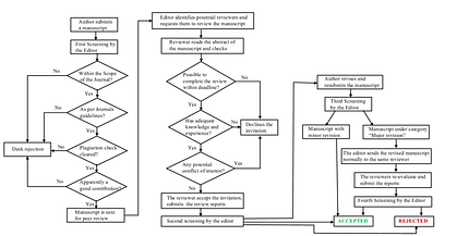
Figure 7: Flow chart of the review process
7. Control Chart
The control chart or Shewhart control chart was introduced and developed by Walter A. Shewhart in the 1920s at the Bell Telephone Laboratories and is likely the most “technically sophisticated” for quality management (Montgomery, 2009). Control charts are a special form of “run chart that illustrates the amount and nature of variation in the process over time”. Also, it can draw and describe what has been happening in the process. Therefore, it is very important to apply a control chart, because it can observe and monitor the process to study process that is in “statistical control” (No problem with quality) accordant to the samplings or samplings between UCL and LCL (upper control limit (UCL) and the lower control limit (LCL)). “statistical control” is not between UCL and LCL, so it means the process is out of control, then control can be applied to find causes of quality problem, as shown in Figure 8 that A point is in control and B point is out of control. In addition, this chart can be utilized for estimating “the parameters” and “ reducing the variability” in a process (Omachonu and Ross, 2004). The main aim of a control chart is to prevent the defects in process. It is very essential for different businesses and industries, the reason is that unsatisfactory products or services are more costly than the spending expenses of prevention by some tools like control charts (Juran and Godfrey, 1998). A Control Chart is presented in the following Figure.
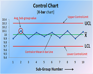
Figure 8: The control chart
Benefits of Implementing 7QC Tools:
-
Improved Decision Making: The 7QC (Seven Quality Control) tools provide a systematic approach to gathering, analyzing, and interpreting data. This helps in making informed decisions based on concrete evidence rather than gut feelings.
-
Problem Solving: These tools aid in identifying and solving problems at their root cause, preventing recurring issues. This proactive approach enhances overall efficiency and product/service quality.
-
Cost Reduction: By addressing issues at an early stage, the 7QC tools help reduce the cost associated with defects, rework, and customer complaints.
-
Enhanced Communication: The visual nature of these tools facilitates effective communication among team members, stakeholders, and management. Complex data is presented in a clear and understandable format.
-
Employee Involvement: Implementing these tools encourages employee involvement in problem-solving processes. It fosters a culture of continuous improvement where every team member is engaged in maintaining and improving quality.
-
Standardization of Processes: The tools promote standardization of processes by identifying best practices and eliminating variations, leading to consistent and predictable outcomes.
-
Customer Satisfaction: Through the systematic elimination of defects and improvement of processes, the overall quality of products or services increases, resulting in higher customer satisfaction.
How to Implement the 7QC Tools:
-
Identify the Problem: Clearly define the problem or process that needs improvement.
-
Select Appropriate Tools: Choose the relevant tools based on the nature of the problem. The seven tools include Pareto Chart, Cause and Effect Diagram, Control Chart, Histogram, Scatter Diagram, Check Sheet, and Flowchart.
-
Data Collection: Gather relevant data related to the identified problem using the chosen tools.
-
Analysis: Use the tools to analyze the data and identify patterns, trends, or potential root causes of the problem.
-
Develop Action Plans: Based on the analysis, develop action plans to address the root causes and implement necessary changes.
-
Monitor and Control: Implement the changes and continuously monitor the process using control charts or other tools to ensure sustained improvement.
-
Document and Standardize: Document the entire process, including the problem, analysis, action plans, and results. Standardize the improved process to maintain consistency.
Real-World Examples of 7QC Tools Implementation:
-
Pareto Chart: A manufacturing company uses a Pareto Chart to identify and prioritize the most frequent defects in its production line, allowing it to focus on the critical issues first.
-
Cause and Effect Diagram: A software development team used this tool to identify the root causes of recurring bugs, leading to improvements in the coding and testing processes.
-
Control Chart: An automotive company used a Control Chart to monitor the variation in the dimensions of produced parts, ensuring that the manufacturing process remained within specified tolerances.
-
Histogram: A hospital uses a Histogram to analyze patient wait times, helping them allocate resources more efficiently and reduce overall waiting times.
-
Scatter Diagram: A marketing team used a Scatter Diagram to analyze the correlation between advertising spending and sales, optimizing their marketing budget allocation.
Common Mistakes to Avoid:
-
Incomplete Data Collection: Gathering insufficient or inaccurate data can lead to incorrect analysis and ineffective solutions.
-
Ignoring Stakeholder Involvement: Excluding key stakeholders from the process can result in overlooking crucial information and perspectives.
-
Overlooking Cultural Change: Implementing the tools without considering the organizational culture may hinder acceptance and effectiveness.
-
Not Addressing Root Causes: Focusing on symptoms rather than root causes may lead to temporary fixes rather than sustainable improvements.
-
Lack of Follow-Up: Failing to monitor and control the implemented changes can result in a regression to previous problem states.
Your feedback matters! Please let me know how I did with a thumbs up!
CONCLUSION:
This study identified that is very essential to apply all seven QC tools for troubleshooting issues within production processes in organizations. Doubtlessly, all of the aforementioned quality tools should be considered and used by management for identifying and solving quality problems while producing the products and services. Thus, the production processes can be affected and improved by multiple factors of these statistical QC tools. Also, Mirko et al. (2009) designed and developed an effective layout for using these QC in organizations based on their performance of, to apply appropriately these quality tools for solving quality problems and quality improvement, as demonstrated in Figure 9. Accordingly, the following Figure interprets how the 7 QC should be employed from the first step to the end of production processes for identifying the problems of quality performance and controlling them.
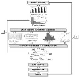
Figure 9: An appropriate layout for using 7QC tools to improve extremely quality performance (Mirko et al., 2009).
FAQ’s:
- Stratification.
- Histogram.
- Check sheet (tally sheet)
- Cause and effect diagram (fishbone or Ishikawa diagram)
- Pareto chart (80-20 rule)
- Scatter diagram.
- Control chart (Shewhart chart)
